- info@businesscardprintingindubai.com
- +971 56 684 1564
- Warehouse # 13, Al Quoz, Dubai
Home » Classic Business Card Printing
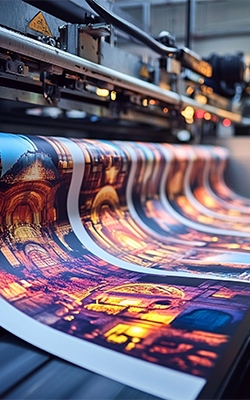
Classic business card printing involves creating durable, visually appealing cards that reflect a company’s or individual’s identity. The process balances design, material selection, and printing techniques to produce a polished final product.
The process balances design, material selection, and printing techniques to produce a polished final product.
A well-designed business card balances aesthetics and functionality. Start by ensuring your logo is prominent but not overwhelming, and choose fonts that align with your brand personality (e.g., serif for traditional industries, sans-serif for modern sectors).
The material of your business card speaks volumes about your brand before a word is read. Standard paper stocks (e.g., 14pt or 16pt thickness) are cost-effective for everyday use, while luxury options like cotton-based paper or soft-touch finishes signal exclusivity.
Review a digital or physical proof to check alignment, colors, and text.
Ensure brand colors (e.g., Pantone) are accurately reproduced.
Verify edges are cut precisely to avoid uneven borders.
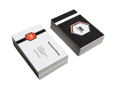
Timeless, professional cards using premium materials (e.g., thick cardstock, matte/gloss finishes). Ideal for networking, with a focus on durability and elegant design.
While classic designs remain popular, integrating digital elements bridges the gap between print and technology. QR codes can link recipients to your LinkedIn profile, portfolio, or a promotional video. NFC (Near Field Communication) chips embedded in cards allow contactless sharing of digital content via smartphone taps. Even subtle additions like a custom hashtag or social media handles encourage online engagement.
Choose recycled or FSC-certified paper.
Use eco-friendly inks (soy-based or water-based).
Minimize waste through efficient design and batch printing.
Prioritize readability with clear fonts and contrast.
Align the design with your brand’s visual identity.
Include a call to action (e.g., QR code linking to a portfolio or website).
Opt for durable materials if longevity is important.
Overcrowding the design with too much text or graphics.
Using low-resolution images or logos.
Ignoring bleed areas (extra space around the design to prevent white edges).
Typos or outdated contact information.
Use hierarchy to emphasize key details: your name and title should be the largest text, followed by contact information.
ypography is more than just selecting a font—it’s about readability and brand alignment. Avoid overly decorative fonts for body text; instead, opt for clean, legible typefaces like Helvetica, Garamond, or Futura.
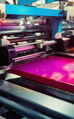
Glossy paper amplifies color vibrancy and sharpness, making photos, logos, or gradients pop. Ideal for bold, eye-catching designs that demand attention in well-lit settings.
Choose full gloss (mirror-like shine) or soft satin finishes. Pair with spot UV for textured contrasts (e.g., matte details on glossy backgrounds).
The laminated coating protects against fingerprints and minor wear, ensuring cards stay pristine during frequent handling or storage.
Perfect for photographers, artists, real estate, or retail brands where vivid imagery and first impressions drive client engagement.
Standard Business Cards in Dubai printed on high-quality paper with clean and professional layouts. A cost-effective, reliable choice for everyday business branding.
Specialty Business Cards in Dubai designed to make your brand stand out with unique materials and finishes. Perfect for businesses looking for creative, high-impact card designs.
Glossy Paper Business Card Printing in Dubai with vibrant colors and a brilliant shine. Ideal for bold, high-quality business cards that impress instantly.
When it comes to creating premium business cards that truly represent your brand, Best Business Printing Card is a trusted name in Dubai. Here’s why businesses choose us:


Partner with Best Business Printing Card and experience business card printing like never before. Contact us today for a free quote!

© 2025 Business Card Printing in Dubai – All rights reserved |
WhatsApp us